Candidate photos and logos are the two most important marketing tools used by every political campaign. Once these two things are established, all other marketing pieces will fall into place. This flyer by Bill Gunn for US Representative of Massachusetts shows that even the most essential components of a campaign can sometimes be the least effective.
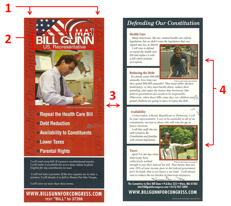
The front of this card has a conventional layout with a few twists. It contains the standard logo, picture, contact information, and also a few bullet points taken from the candidate's platform. An interesting decision was to include the motto and election date using a vertical script with a maroon on red background (1). Even though this was intended to be subtle, anytime you shift the text direction 90° it creates a difficult experience for the reader. Since Gunn also included a rather long personal message on the front, the only area that is not covered in text is the picture.
With the last name "Gunn," there should have been no problems creating a logo that resonates with the voter. However, the logo that was created (2) minimizes the impact by including the stars and stripes, a large checkmark, and a "MA-1." In fact, the checkmark cuts into Gunn's last name which makes it difficult to read - something all campaigns should avoid.
When creating a flyer layout, it is important to make a distinction between the front and back of the flyer. At a quick glance, the reader should know which side of the flyer they are looking at. One thing I like about this flyer is how it accentuates this concept by using red with blue accents on the front, while the back uses blue with red accents (3), making a seamless transition for the reader.
There is an old saying, "A picture is worth 1000 words," and in political marketing this could not be more true. Each of the photos used on this flyer are fine on their own, however, they do not add any diversity when grouped together.
The back of the flyer (4) includes a photograph of Bill doing some roof repair accentuating his blue collar background, while the second photo is intended to appeal to sportsmen. When scanning all of the photos side by side it is rather peculiar that there is no one else photographed other than Bill. The absence of Bill's family, friends, or even supporters makes him seem... well, antisocial. Even worse, not one of these photos of Bill shows him with a smile on his face.
"Of all the things you wear, your expression is the most important." - Janet Lane
The Good
1. Good distinction between the front and back
2. Easy to read bullet points
3. N/A
The Bad
1. Hard to read candidate's name in the logo
2. Vertical and Horizontal words on the front
3. Photographs used are 1 dimensional
Overall Rating: D
 RSS Feed